


Lois Leonard shows you how to teach your class to communicate with colour...
Like musicians and authors, artists and designers have their own creative language and vocabulary. One part of this vocabulary is colour.
Colour infuses our world with emotion and meaning. From the zingy tang of citric green to the mellow richness of cocoa brown, our world inspires, repulses, cajoles, warns and informs us through visual messages in colour.
If we think of colour as visual adjectives, it becomes easy to appreciate its importance in art and design. Careful use of colour adds expression and emphasises details. We shouldn’t settle with the first colours that pop into our head. We need to ask questions and experiment with ideas to find the best solutions. What impact do we want to make? What strength of colour should we choose? Shall we combine colours? Which colour should dominate? Should there be a hint of colour or should colour flood the design?
For children to be able to ask and answer these questions they must understand some basic colour theories, how to apply them and when to break the rules.
 The colour wheel
Most of us are familiar with the colour wheel, which shows the relationship between different colours, or hues: the primary hues are red, blue and yellow; secondary hues are made by mixing equal parts of primary hues. The colour wheel flows from one primary hue to the next through their secondary hues.
The colour wheel is a nifty tool for grouping colours and helpful for selecting colours to create different effects and impacts. Just as artists and designers refer to the colour wheel during their work, children should too.
Create a gigantic colour wheel collage for children to refer to as part of their future work. Organise the class into colour teams to dig and delve through magazines and find samples of their allotted colour. Grade the values of each hue; a tint has white added while a tone has black added to the base colour. Ask each group to arrange their samples in wedges which can come together to make a colour wheel.
 Harmony and contrast
The way in which colours are combined has great impact on a design. Colours which lie next to each other are harmonizing, such as red and orange or green and blue. These colour combinations sit easily with each other and create a sense of unity.
Colours that lie opposite each other are complementary, such as red and green or purple and yellow. These colours jostle with each other and create a lively effect.
Artists and designers often work with a palette of harmonious colours suited to the theme of their work, and use a complementary accent to draw attention and enliven part of their design. Look carefully at advertisement posters and you may notice the key messages and images are highlighted in complementary colours.
Create a campaign poster of your own using harmonising colours to represent the theme, and a complementary colour to draw attention to a word that captures the essence of the message. There are many ICT publishing and word processing packages that will allow children to try different colour combinations quickly and easily.
 Emotional reactions
Different colours create different emotional reactions, for example bright red is exciting, soft green is calming and yellow is cheerful. Much of our emotional reaction to colour is a subconscious influence from nature, but it can also stem from modern convention and cultural heritage.
Ask children to link different emotions to colours. Provide a list of words, such as elegant, angry, romantic, happy and sick. Discuss the meaning of each word and consider which colours best express the words. It may be useful to think of objects, places or occasions that represent the words, and link colours via these associations.
Extend this activity by creating an abstract work of art that represents the emotions played out in a short story or poem. Read the text carefully and consider the emotions described. Think carefully about colours that represent these emotions. Use these colours to create your masterpiece; represent dominant emotions with large areas of colour, and subtleties as small shapes or thin threads running through the piece. Don’t forget to use complementary colours to represent conflicting emotions!
 Identity
Many companies and sports clubs use colour as part of their identity. The colours they use are often as strong a part of their image as their name or logo. Which supermarket do you associate with the colour green? Which football team do you associate with the colour blue?
Imagine that a multinational company decides to sponsor your school sports team. They will buy sports kit for all the players on condition that the uniforms are re-branded in the company colours. What will the new kits look like? Ask children to select an appropriate company and research the colours used in the corporate identity. Use these colours to create a new school sports uniform that lets people know about the sponsoring company without their name or logo appearing on the kit.
Lois Leonard is Technological Resource Designer at the Design and Making Centre, Cornwall.
This is a selection of colours and the emotions commonly associated in western culture. Note that some colours have conflicting emotional relations.
White: pure, clean, empty
Red: anger, love, strength
Pink: gentle, sweet, romance
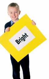
Yellow: cheerful, bright, cowardly
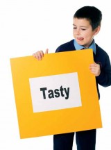
Orange: warm, happy, tasty
Green: calm, envy, sick
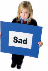
Blue: cool, serious, sad
Purple: rich, creative, status
Grey: cold, uniform, dull
Black: dark, elegant, sinister
More experiments with colour…
Children often have a sweetie shop opinion of colour; they see it, they want it, and then they want more! Limiting the colour options available actually raises the creative bar; children have to think very carefully about how they can maximise outcomes from minimal resources. What can you do with only three colours? Can you creative a masterpiece from only two?
Create inspirational colour displays. Select a range of artworks and ask children to extract the colour palettes used. Find colour themes in products and consider why certain colours are preferred: cereal packaging, national flags, cars, even socks make for an interesting study.
Cornwall Learning offers a wider range of services and support for schools and education settings throughout Cornwall. This article is based on teaching resources produced with Cornwall Learning, which are available through the Design and Making Centre catalogue. Please contact 01209 615065 for further information.


Power Maths – A Child-Centred, ‘Can-Do’ Mastery Teaching Programme for KS1 and KS2
Category: Maths

Fit To Dance Schools From Disney On Ice
Category: Other

‘S!ng Sensational’ And ‘A King Is Born’ – Two Fun New Musical Masterpieces That Children Will Love
Category: Music
Product review: Schofield & Sims Fractions, Decimals & Percentages
Category: Maths

Why Boarding School Fiction Feels Comfortably Familiar
Ace-Classroom-Support

KS2 Lesson plan: China and Buddism
Ace-English

How to use modelling to engage pupils with autism
Ace-Art-And-Design


